WilliWear New Wave Graphics
Julie Pastor
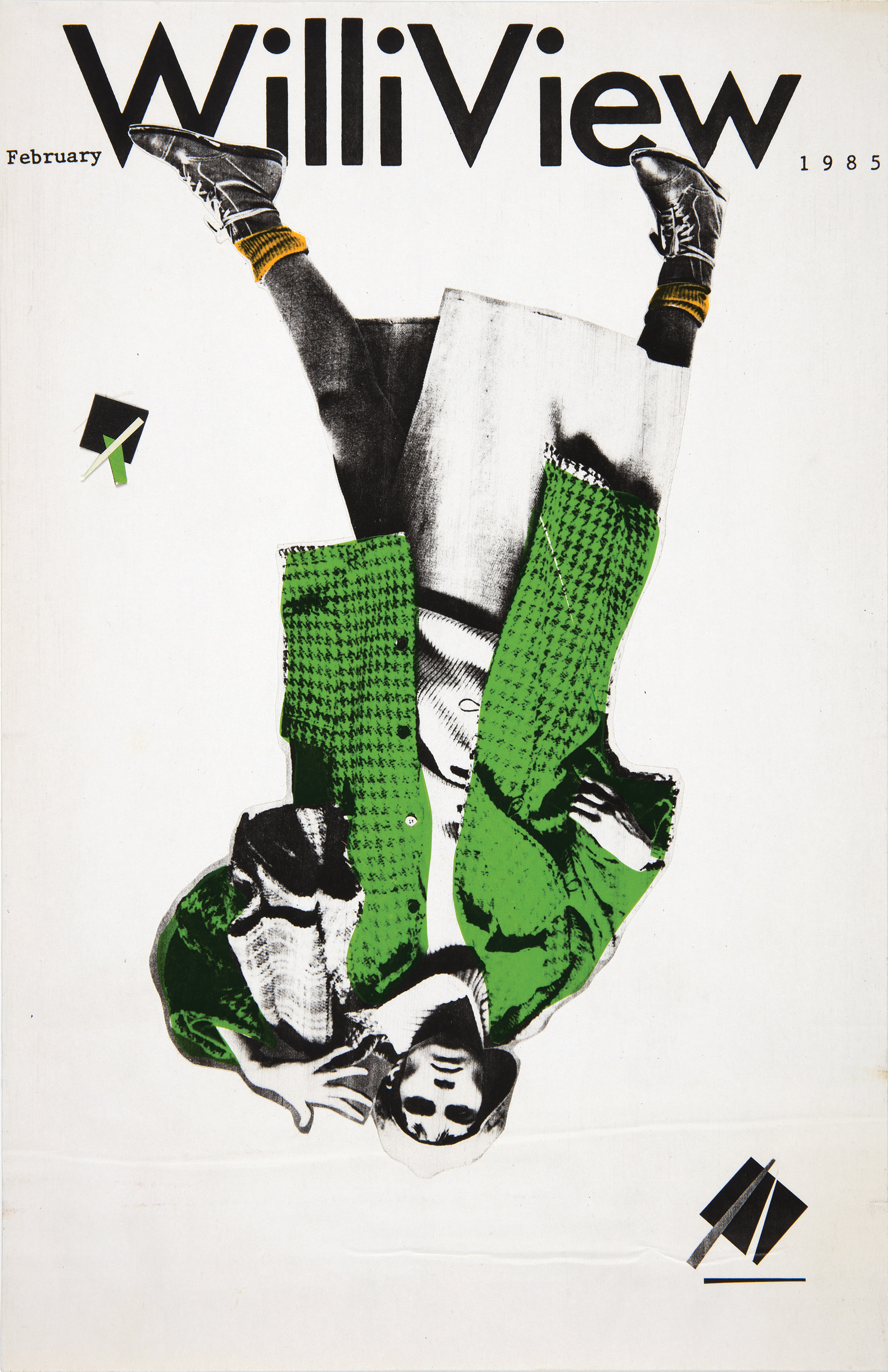 Bill Bonnell for WilliWear, WilliView Maquette, 1985
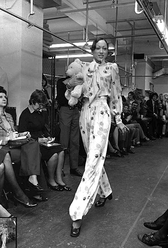
Willi Smith’s designs presented new takes on elevated basics with a mission to make fashion accessible and affordable to everyone. His democratization of fashion echoed key values of modernism, which aimed to bring good design to the masses, but Smith’s production of interiors, events, and performances broke down traditional hierarchies of high and low art in a playful manner that was decidedly new. The experience of WilliWear’s innovative productions often began with a program of creative graphics—invitations, posters, and press kits—that captured the spirit of the collections through new forms and collapsed the rules that had communicated modern graphic design for decades. These materials defined the brand while creating a platform for emerging graphic designers to present the New Wave of good design to a mass audience of U.S. consumers.
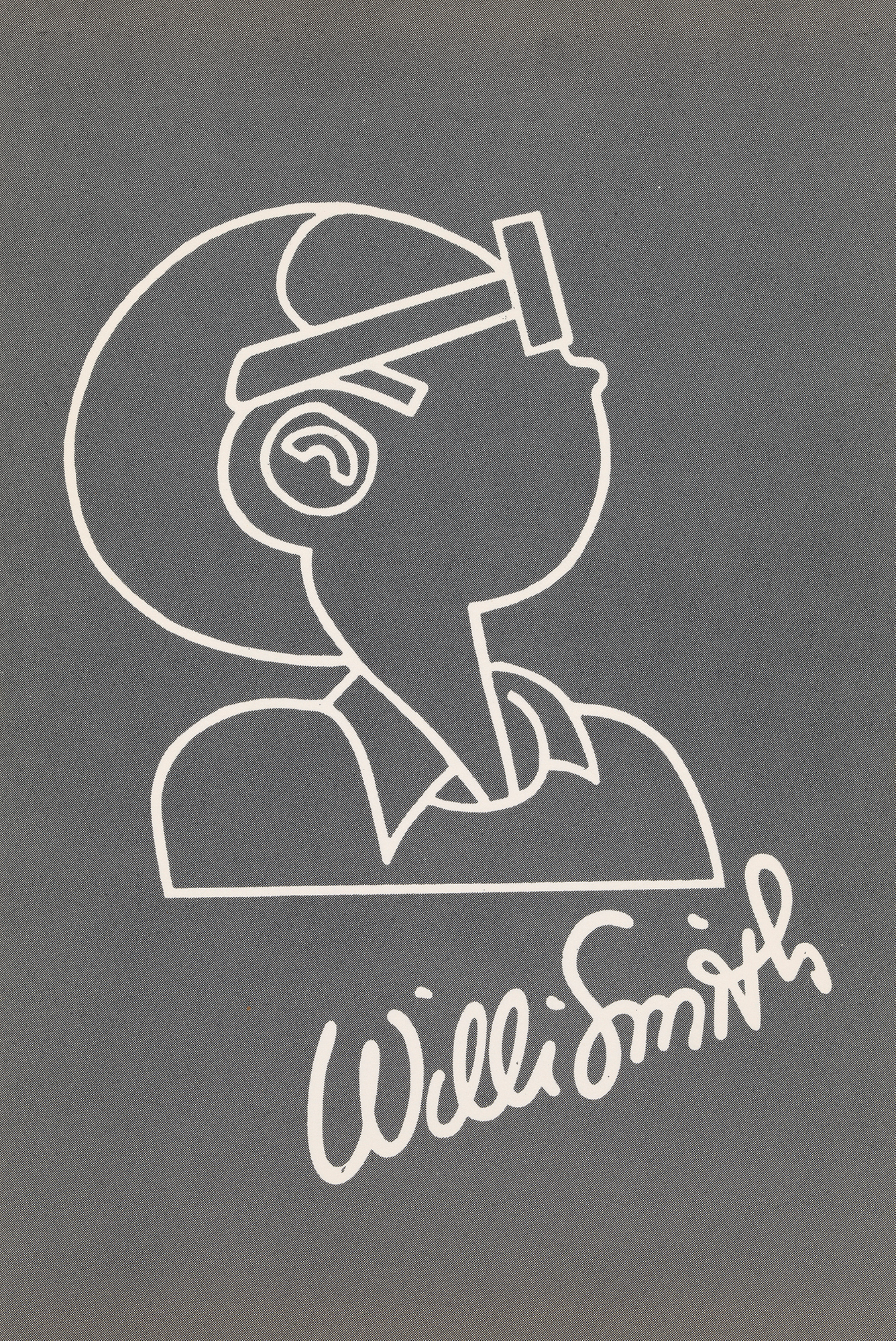
Though Smith had no formal graphic design training, his early works show an adoption of graphic pattern as a marketing tool and signature. A 1972 collection for Digits contained dresses and a jumpsuit printed with pairs of Smith’s trademark round eyeglasses. A 1973 wrap dress for Digits featured layers of colorful postcards spilling onto solid black ground. Smith’s name appears as the postcard’s addressee throughout the pattern, cleverly embedding his signature into the overall effect. And when Smith formed WilliWear with Laurie Mallet in 1976, the brand’s first logo was a portrait drawn by Smith of his face in profile, later replaced with the name WilliWear in a sans serif font overlaid with Smith’s signature.
By 1983, WilliWear’s profile and profits had increased substantially, and Smith was interested in removing his face and signature from the identity while preserving the brand name of his ready-to-wear clothing.1 Smith and Mallet began consulting with graphic designer Bill Bonnell to create a new design. Bonnell’s black-and-white WilliWear logo united the names of the designer and the company in a bold graphic statement that could be manipulated and reversed in a variety of applications. By layering the identity to create shadows, the designer created a false sense of depth and transformed the logo into an allover pattern. Physically crumpling sheets of the pattern and then photographing them produced yet another new texture, evoking trash on the street, as well as folds of fabric.
Bonnell had been recommended to Smith and Mallet by their friend, designer Dan Friedman, whose work Bonnell had included in a 1977 exhibition he curated at the Ryder Gallery in Chicago, titled Post-Modern Typography, Recent American Developments. Before Bonnell’s exhibition, the term “postmodernism” had almost exclusively been used to describe the architectural movement, appearing sporadically in design journals from the early seventies and to a mass audience in Charles Jencks’s 1977 publication The Language of Post-Modern Architecture.2 Wolfgang Weingart pioneered the origins of New Wave graphics in Basel, Switzerland, in the late sixties, challenging the traditional rules of modern graphic design by manipulating typographic relationships and subverting the rigid regularity of the grid. While even spacing between letterforms held modern typography together to make words predictable and readable, Weingart increased those spaces and made them irregular. With text unbound from the grid, words traveled in a collision of vertical, horizontal, and diagonal lines, stretching the limits of legibility. Friedman met Weingart during his studies at Basel’s Kunstgewerbeschule and encouraged him to share his work with an American audience in a 1972 lecture tour of several cities in the United States, inspiring designers across the country to experiment with the new approach.3
Like Friedman, Bonnell too formed his original sense of postmodern graphic design from Weingart’s examples and the work of fellow Swiss revisionists, an aesthetic that he introduced in his work as he progressed in the profession. He began his career at Container Corporation of America (CCA) in Chicago in 1971, where his work largely adhered to the modernist style established for the company by Bauhaus designer and CCA consultant Herbert Bayer. After moving to New York in 1978, Bonnell briefly designed packaging for J. C. Penney and formed his own design consulting office in 1979.4 His interest in the postmodern typographic aesthetic of the Basel school began to manifest most clearly in his designs for office furniture manufacturer Sunar, which combined traditional forms in unexpected ways to create new relationships between word and image. A poster promoting the work of architect Michael Graves featured a series of windows that, when unfolded back from the surface, revealed Graves’s chair designs. While modernist graphics had long portrayed an attitude of permanence, Bonnell embraced the ephemerality of graphic materials. His designs felt lighthearted and immediate.
Like Friedman, Bonnell too formed his original sense of postmodern graphic design from Weingart’s examples and the work of fellow Swiss revisionists, an aesthetic that he introduced in his work as he progressed in the profession. He began his career at Container Corporation of America (CCA) in Chicago in 1971, where his work largely adhered to the modernist style established for the company by Bauhaus designer and CCA consultant Herbert Bayer. After moving to New York in 1978, Bonnell briefly designed packaging for J. C. Penney and formed his own design consulting office in 1979.4 His interest in the postmodern typographic aesthetic of the Basel school began to manifest most clearly in his designs for office furniture manufacturer Sunar, which combined traditional forms in unexpected ways to create new relationships between word and image. A poster promoting the work of architect Michael Graves featured a series of windows that, when unfolded back from the surface, revealed Graves’s chair designs. While modernist graphics had long portrayed an attitude of permanence, Bonnell embraced the ephemerality of graphic materials. His designs felt lighthearted and immediate.

Many of the titans of modern graphics derided this shift. In 1980, when Bonnell was working as a consultant on a brochure at IBM, he energized Paul Rand’s IBM logo by adding a shadow behind the plus sign at the center of the brochure. Though this addition fit within the company’s guidelines for the identity and was approved by IBM, Rand was so affronted by the intervention when he saw it that he ordered the printed brochures to be destroyed. He further described Bonnell’s mixing of typefaces within the brochure as an “abomination.”5 In the face of this almost comical resistance to change and the persistence of corporate modernism in the eighties, Bonnell described postmodernism as a “general sense of freedom concerning what graphic design can consider its source material” and encouraged designers to liberate themselves from traditional limits.6 This freedom in graphic design aligned directly with the spirit of WilliWear, making the New Wave style a perfect means to message the company’s creative output.
While these deconstructive elements of postmodern graphic design may seem familiar today, presenting a major fashion brand through this aesthetic was unprecedented at the time.
In his work for WilliWear, Bonnell expressed this freedom through montages of jagged edges and diagonals that presented text as image, inviting the eye to dance around a composition to distill its meaning. The posters that accompanied WilliWear collections creatively transformed the identity of the brand—something traditionally presented to consumers as an unchanging corporate face. In Street Couture from 1983, the logo floats diagonally toward the lower left of the poster, layered over a striped triangle strategically placed to allow it to stand out from the background without the need to delineate the logo’s form. The reversal of the word “street” on black ground and “couture” on white reinforces the scheme of the WilliWear logo. Bonnell’s 1984 poster for City Island takes that reversal to a new extreme with vertical letterforms irregularly changing from white to black against a collage of abstract shapes resembling torn layers of paper. While these deconstructive elements of postmodern graphic design may seem familiar today, presenting a major fashion brand through this aesthetic was unprecedented at the time, making WilliWear one of the first companies to exhibit New Wave graphics.
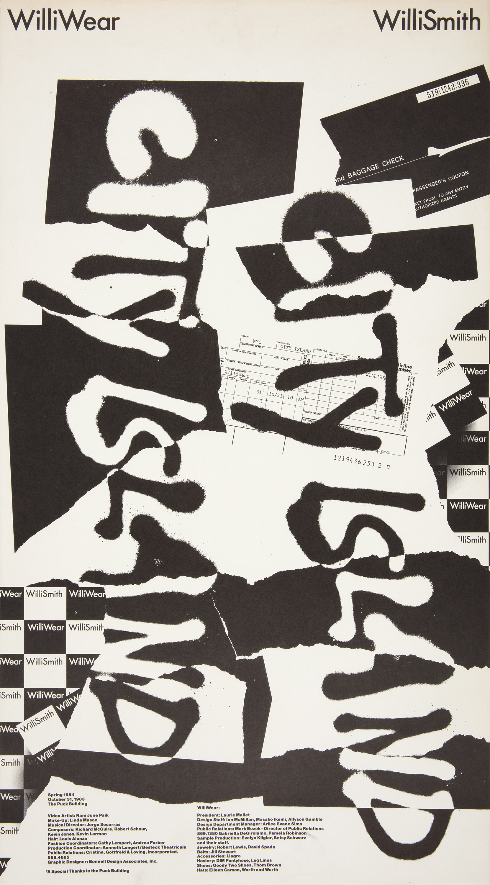 Bill Bonnell for WilliWear, Poster, City Island Spring 1984 Presentation, 1983


Bill Bonnell for WilliWear, Invitation, City Island Spring 1984 Presentation, 1983
The graphics also contributed to the conceptualization of WilliWear as a lifestyle brand that captured the spirit of the street. The rugged identities formed a cohesive dialogue with Smith’s “street couture” and the architecture of the SITE showroom and stores, which brought the raw elements of the street inside to create immersive retail environments. The films that accompanied WilliWear fashion shows featured graphic animations that twisted and flashed the logo, infusing the identity with pulsating, responsive energy. The dense collage of the 1984 poster for the film and fashion collection SUB Urban interpreted the layers of printed advertisements that appear in the urban environment as a single unified surface. Here the bulky layering of text makes most of the poster’s contents illegible, and the WilliWear logo is so obscured that the few times it irregularly repeats throughout the composition are almost impossible to discern. Because of the brand’s strong association with this postmodern graphic style—and with forward-thinking design more broadly—the logo acts as a point of reference rather than as the face of the company.
Inspired by the whimsy and originality of Smith’s collections and their imaginative themes, Bonnell recalled that “the designs for invitations and press kits were always unusual.”7 The cover of the booklet that served as the invitation for Street Couture adopts standard calligraphy to invite guests to attend an “out-of-the-ordinary fall presentation.” Flipping through the booklet provides the event details in an unconventional manner that culminates in a long-exposure abstraction representing Smith’s collaboration with video artist Juan Downey.
For City Island, invitees received plane tickets—which Bonnell created by copying actual airline tickets—with the event details listed as a travel itinerary. Playing on a common souvenir sold to tourists in cities all over the world, an accordion of postcards invited guests to the 1983 Sightseeing spring fashion show. Rather than listing cities, each postcard with its black-and-white illustration defined a theme within the overall collection.
WilliWear press kits evoked the same spirit of play and interaction. For Street Couture, a clear plastic sleeve held an array of irregularly cut colored forms, each printed on unusual coated papers with metallic, matte, wood-grain, and pearlescent finishes. Turning the sheets and arranging them in new sequences invited the recipient to create multiple ways of seeing the material, and printing in black ink on the reverse of such colorful papers made the kits more affordable to produce.
Bonnell’s graphics were always complementary to what Smith was designing, and the designs were developed and discussed with the WilliWear team—“Willi was involved in everything,” Bonnell said. While their relationship was professional, they shared a mutual respect for each other’s creativity. Bonnell recalled arriving at the WilliWear offices on a rainy day wearing a cowboy’s oilcloth raincoat that he had purchased at Macy’s. Smith was fascinated by the coat, and after some quick questioning—“Where did you get that coat?”—he had it in hand and drew a pattern inspired by the design in a matter of minutes. Bonnell was amazed to watch Smith’s creative process unfold so quickly.


Willi Smith for WilliWear, City Island Spring 1984 Presentation, 1983
While Bonnell stopped designing for WilliWear in 1985, the company continued to employ graphic designers to use new and unexpected means to highlight Smith’s creative collaborations. Mallet hired Dean Alexander, who had worked for Bonnell, to design a few later projects when he formed his own graphic design company.8 The irregular horizontal lines in Alexander’s poster for the 1985 fall season reference the static of a television screen, a common element in Smith’s multimedia fashion shows that integrated video by artists such as Juan Downey, Nam June Paik, Les Levine, Max Vadukul, and Paul Garrin. The announcement for the 1986 fall collection Totally Serious reveals itself as the poster unfolds, requiring a personal interaction with the material to receive the complete message.
Smith’s interest moved beyond graphic commissions to magazine making at least as early as 1985. Two collages by Bill Bonnell for an unrealized magazine called WilliView reveal Smith’s wish to extend the meaning of WilliWear beyond that of a traditional fashion company, elevating the brand to a publishing platform for collaborative conversations about the arts. Below the title in the February 1985 WilliView mockup, the project is simply described as “[a]n Interdisciplinary magazine of fashion, art, architecture, and music.” The incomplete table of contents shows plans for articles on SITE, Smith’s collaboration with Keith Haring and Bill T. Jones/Arnie Zane Dance Company on the production Secret Pastures, the fall 1986 WilliWear collection, and the opera Einstein on the Beach composed by Philip Glass. This progressive juxtaposition of topics showed Smith’s commitment to democratizing art and breaking down the barriers that traditionally separated disciplines. Dan Friedman said of Smith and Mallet at the time that “they believe in creative people on the cutting edge, whether they be in theater or art.”9
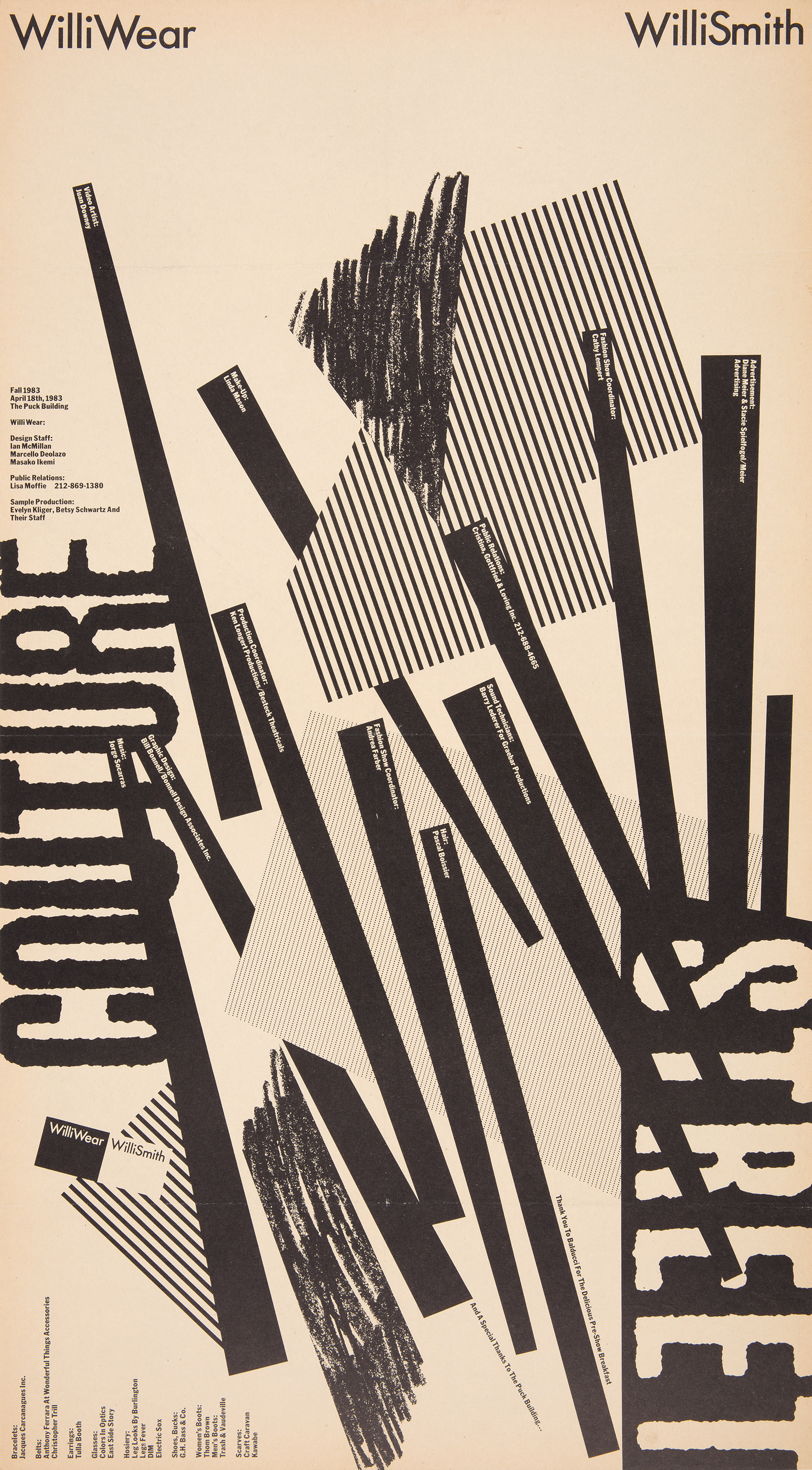 Bill Bonnell for WilliWear, Poster, Street Couture Fall 1983 Presentation, 1983
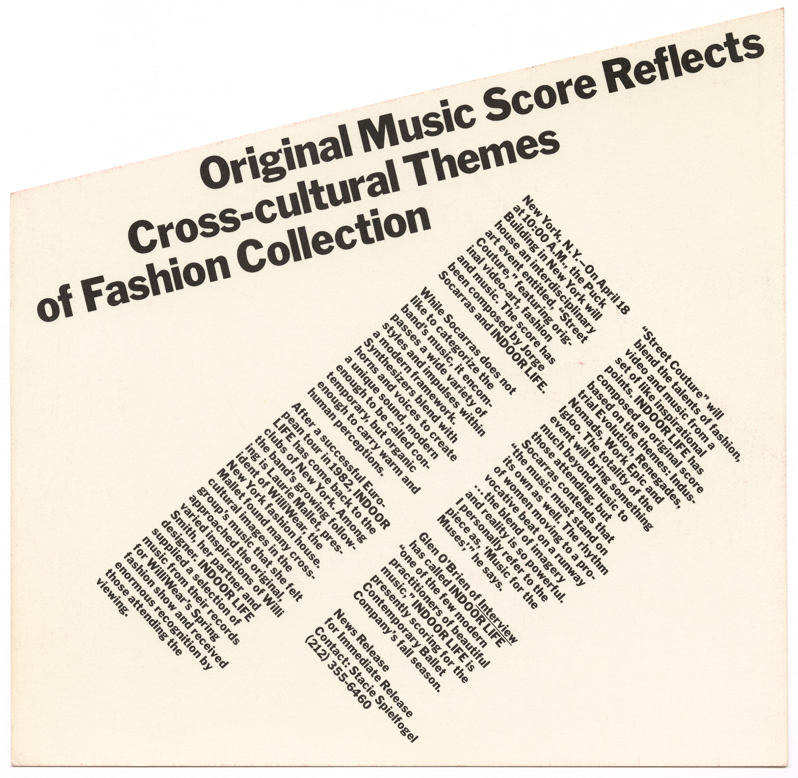
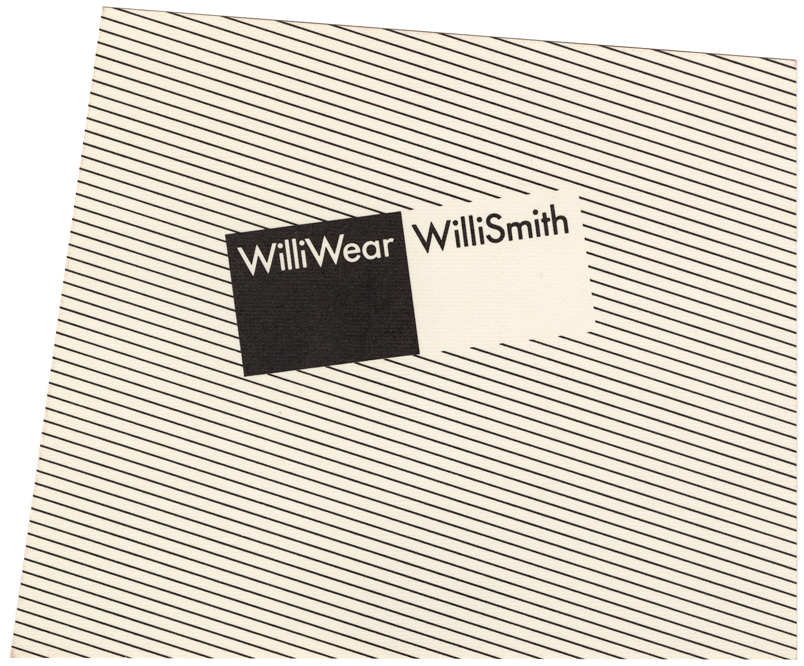
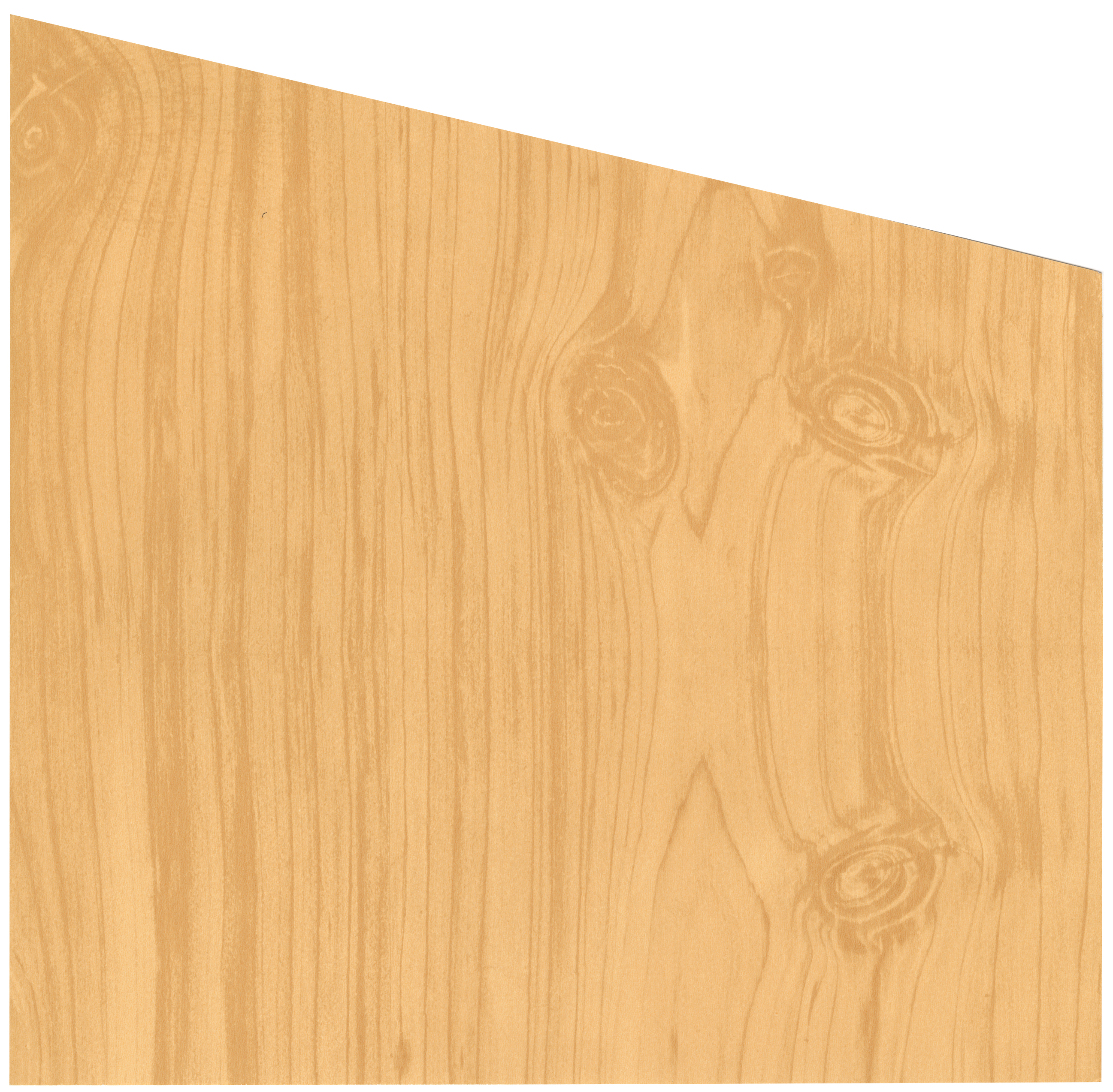
Bill Bonnell for WilliWear, Press Kit, Street Couture Fall 1983 Collection, 1983
Though plans for WilliView were abandoned, Smith soon found another opportunity to publish through the WilliWear News, which he produced in 1986 with his close friend Kim Hastreiter, Paper magazine’s cofounder. Carlo McCormick, then senior editor of Paper, recalled Smith’s love for the magazine: “Paper never had any financial backers. If Willi had had more money he would have bought the whole thing.” Paper’s editions of WilliWear News use the tools of publishing to create a forum on lifestyle. Play was essential to the design and reading experience. The nonlinear publication unfolded into a poster, whose lack of pagination McCormick described as a direct refusal of traditional advertising structures in publishing as well as an embrace of the eccentricities established by zine culture. Though the WilliWear News was not explicitly an interdisciplinary art journal, both issues were full of short stories that mixed in the arts alongside details from WilliWear collections. A photo of an all-white interior designed by SITE was accompanied by the directive, “This is definitely a room to wear all black WilliWear in.” Elsewhere on the page, an image of a plate made by artist Jean-Michel Basquiat contrasts with an African mask. Both black-and-white pieces came from Smith’s personal art collection, and their relationship on the poster speaks to his diverse interests. By peppering these stories throughout the unfolding graphic publication, Smith told a story of himself as well as his fashions.
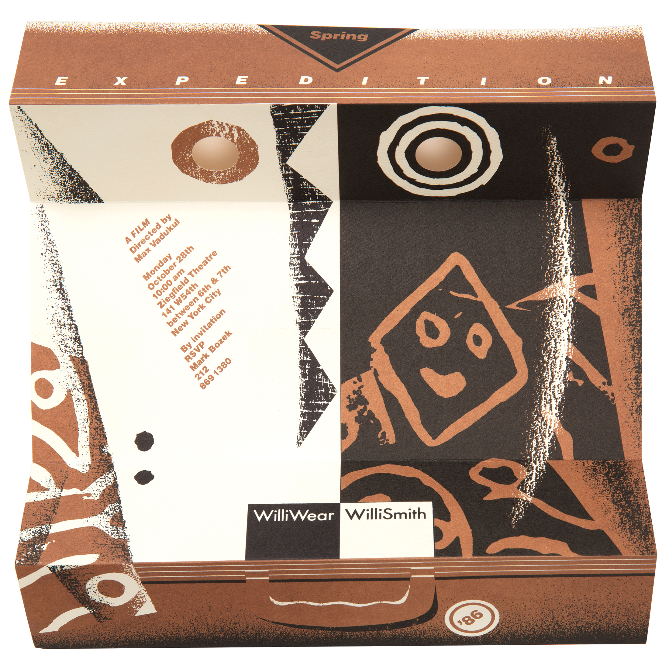
Though WilliWear’s promotional graphics of this period lack the explicit connections to Smith that he published in the WilliWear News, their designs presented increasingly personal references. In 1985, Smith and WilliWear produced the narrative fashion film Expedition as a new way to display the spring 1986 collection, filming in Senegal with actors and dancers wearing the complete line in a range of colors. Graphic designer Steve Orant emblazoned a black-and-white African mask on the cover of the press folder, which familiarly played on the WilliWear graphic identity. Though the mask’s resemblance to the brand’s logo allowed it to function neatly as an advertising symbol for Expedition, it also directly referenced a mask in Smith’s collection of African art featuring a bilateral black-and-white design. Orant’s invitation to the film’s screening at the Ziegfeld Theatre took on the appearance of the suitcase carried by the film’s central character—unfolding it provided invitees with the event details while transforming the invitation into yet another version of the African mask. Circular cutouts are revealed to form the mask’s eyes, and the suitcase handle suggests the curve of a mouth. The punctured holes, zigzagging lines, and brushed application of color in the invitation and press folder echo formal elements of a screen designed by Dan Friedman, one of the first that Friedman ever exhibited and which Smith had purchased for his loft apartment.10 These graphic connections to objects that furnished Smith’s home brought viewers unknowingly close to personal objects beloved by Smith and established a connection between his New York home and his ancestral one.
Though WilliWear’s promotional graphics of this period lack the explicit connections to Smith that he published in the WilliWear News, their designs presented increasingly personal references. In 1985, Smith and WilliWear produced the narrative fashion film Expedition as a new way to display the spring 1986 collection, filming in Senegal with actors and dancers wearing the complete line in a range of colors. Graphic designer Steve Orant emblazoned a black-and-white African mask on the cover of the press folder, which familiarly played on the WilliWear graphic identity. Though the mask’s resemblance to the brand’s logo allowed it to function neatly as an advertising symbol for Expedition, it also directly referenced a mask in Smith’s collection of African art featuring a bilateral black-and-white design. Orant’s invitation to the film’s screening at the Ziegfeld Theatre took on the appearance of the suitcase carried by the film’s central character—unfolding it provided invitees with the event details while transforming the invitation into yet another version of the African mask. Circular cutouts are revealed to form the mask’s eyes, and the suitcase handle suggests the curve of a mouth. The punctured holes, zigzagging lines, and brushed application of color in the invitation and press folder echo formal elements of a screen designed by Dan Friedman, one of the first that Friedman ever exhibited and which Smith had purchased for his loft apartment.10 These graphic connections to objects that furnished Smith’s home brought viewers unknowingly close to personal objects beloved by Smith and established a connection between his New York home and his ancestral one.
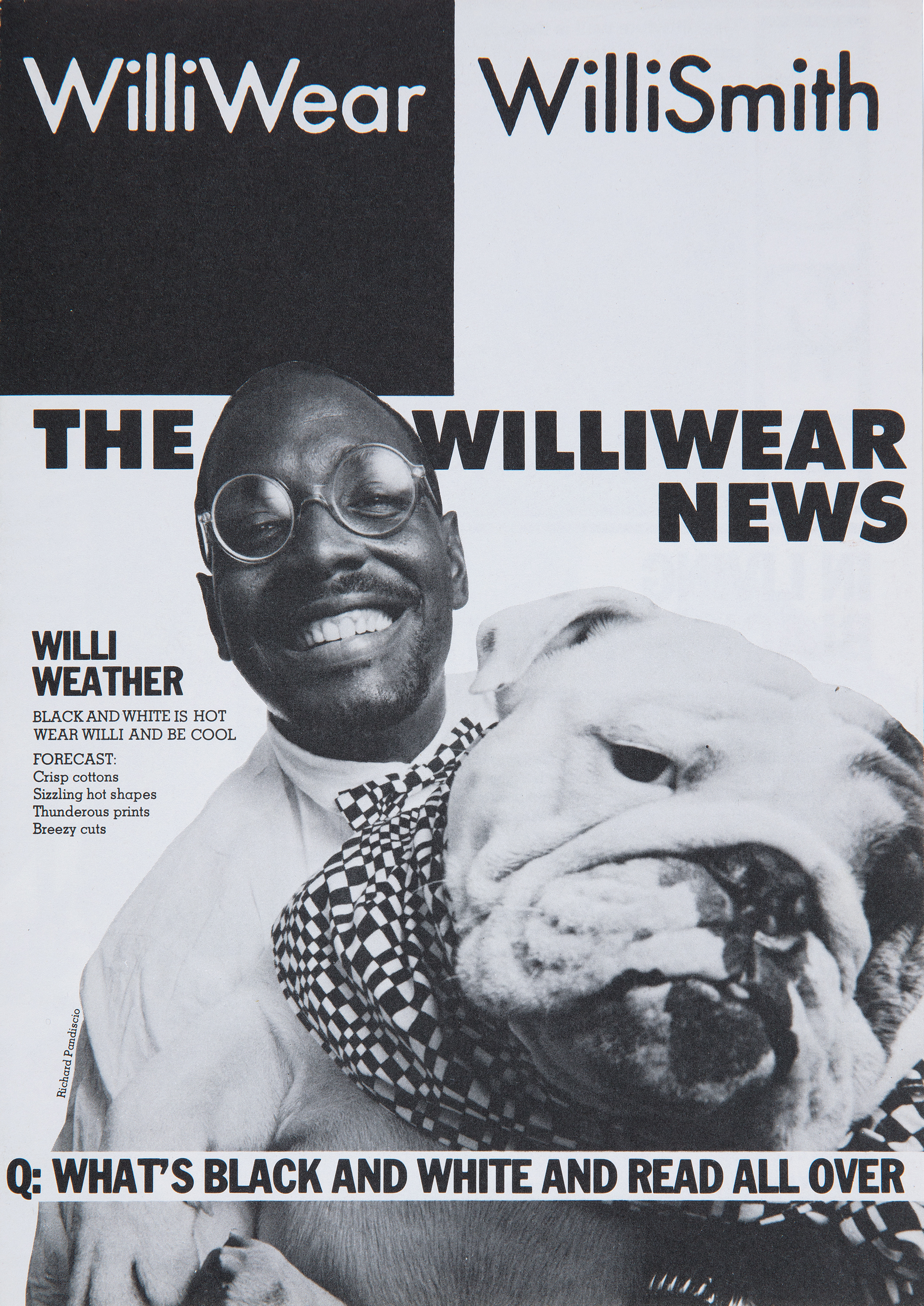 WilliWear News, Summer 1986 Collection, 1986
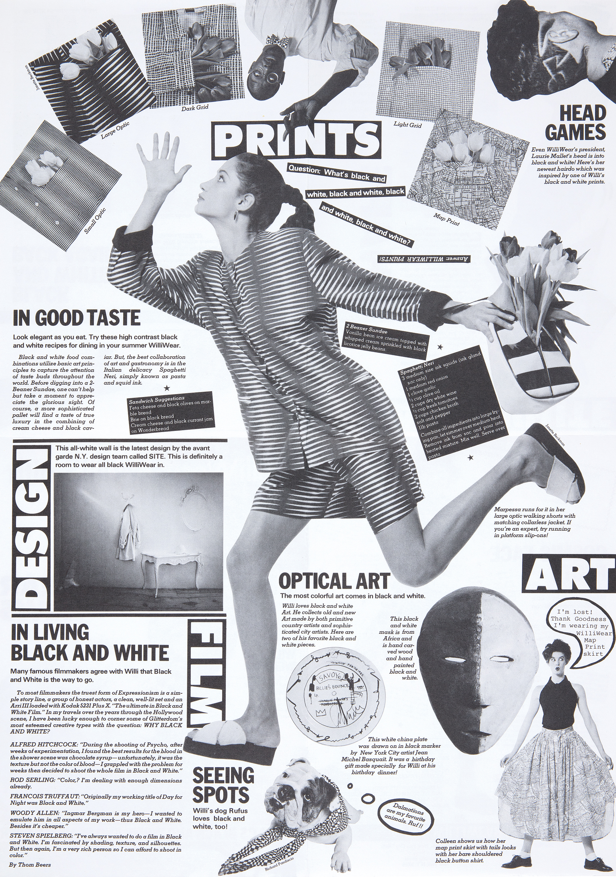 WilliWear News, Summer 1986 Collection, 1986


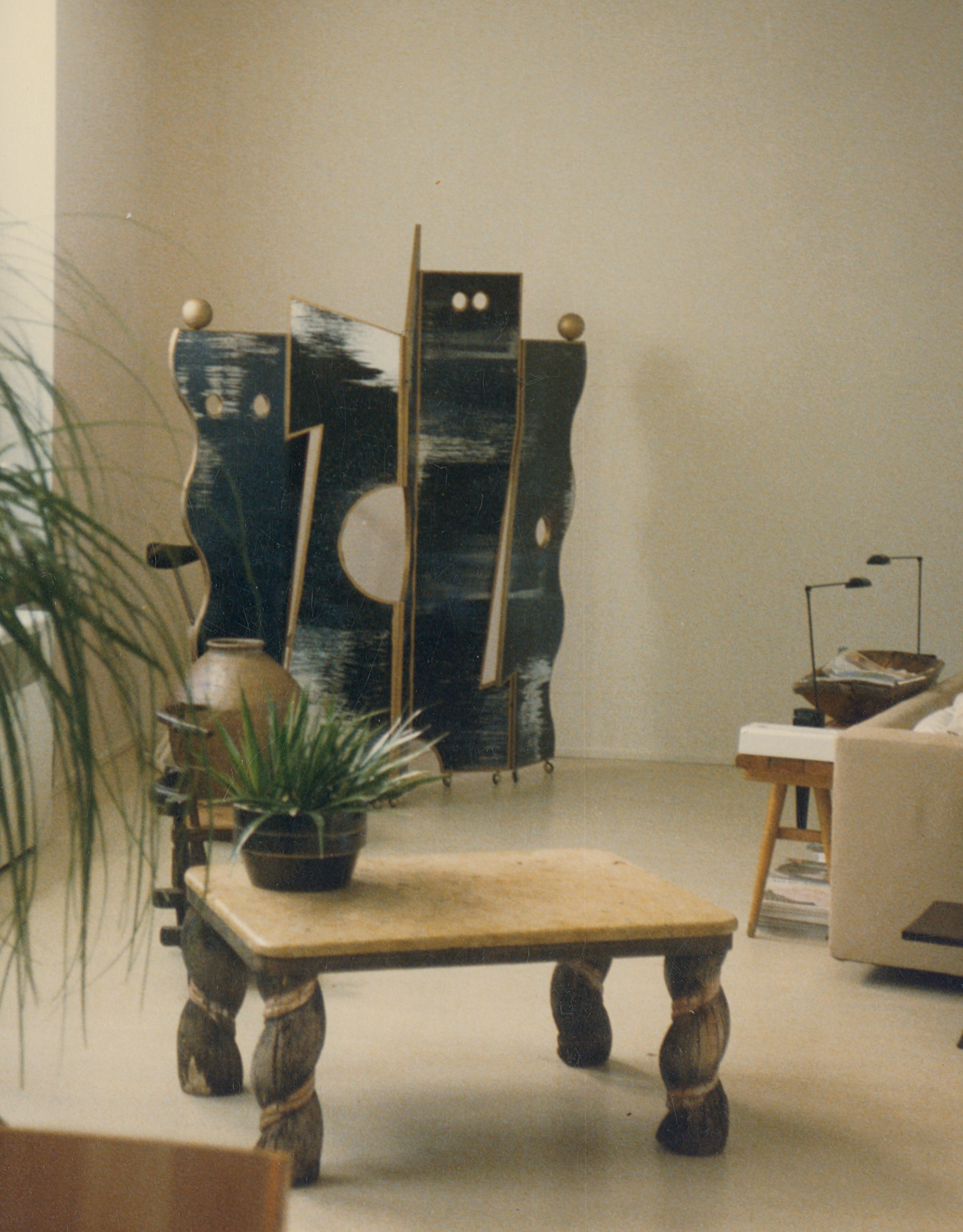

 Dan Friedman for WilliWear, Paris Store, 1987
In addition to the furniture Friedman designed for Smith’s home, he also designed the WilliWear Paris store, which opened in 1988, applying his aesthetic to an interior that contrasted with the established look of the SITE showroom and stores. Friedman had continuously experimented with assembling sculpture and furniture to create immersive environments in the late seventies and eighties, most notably in the living laboratory that was his apartment.11 His designs for the WilliWear Paris store, his first commercial interior, expressed his versatility as a graphic designer, product designer, and artist. He translated the black-and-white dichotomy of the logo to a range of biomorphic and geometric furniture forms, introducing the striped texture that so often appeared in Bonnell’s graphics to decorate an abstract kiosk embellished with Smith’s portrait. In an early design drawing, shelves extend the black and white of the brand’s identity further into the retail environment, providing a ground on which WilliWear fashions could form layered accents. Intentionally or not, the desk in Friedman’s design applies the same stepped detail that appeared in a press folder by Bonnell to a striking furniture form.
In a 1978 issue of Fashion World, Willi Smith remarked, “Today artists are afraid of becoming too commercial, but I don’t believe my creativity is threatened by commercialism. Quite the opposite—I think that the more commercial I become, the more creative I can be, because I’m reaching more people.”12 Smith used his commercial success to make his brand a creative platform, not only for his own designs but also for those of artists and designers he admired working across a range of disciplines. He didn’t have to be a graphic designer to be involved in every aspect of WilliWear’s creative output, and the graphic designers and artists who worked with him embraced his attitude and humor in their work. Many New Wave graphics in the eighties were visible to limited audiences in colleges and art institutions, but Smith broadcast this new postmodern style, making the latest in good design available to everyone. The people Willi Smith needed to reach to be commercially successful were his consumers, and he did so through a wide variety of pioneering means. But the vast circle of creative relationships he fostered speaks to the unique ways in which he was able to reach people and what it meant to them when he did. WilliWear’s graphics present many objectively new and exciting approaches, but they also give us something more personal—a glimpse of the strength of Smith’s creative spirit reflected in the work of others.
Julie Pastor is a curatorial assistant at Cooper Hewitt, Smithsonian Design Museum, where she contributes to exhibitions and publications on modern and contemporary design.
- WilliWear Press Release, 1983.
- Bill Bonnell and Stephan Geissbühler, “Post-Modern Graphic Design in America,” Graphis 40 (1984): 38.
-
Rick Poynor, No More Rules: Graphic Design and Postmodernism (London: Laurence King, 2013), 20−21.
-
David Colley, “Bill Bonnell,” Graphis 39 (1983): 66.
-
Lorraine Wild, “Castles Made of Sand,” in Looking Closer 5: Critical Writings on Graphic Design, eds. Michael Bierut, William Drenttel, Steven Heller (New York: Skyhorse, 2010), 152.
- David Colley, “Bill Bonnell,” Graphis 39 (1983): 66.
- Bill Bonnell in conversation with the author, May 2019.
-
Dean Alexander in conversation with the author, June 2019.
-
Gini Sikes, “Willi Wear It!” Metropolis (March 1985);
- Ibid.
- Dan Friedman, Radical Modernism (New Haven: Yale University Press, 1994), 196.
-
“Wear Willi Wear,” Fashion World (August, 28, 1978).
